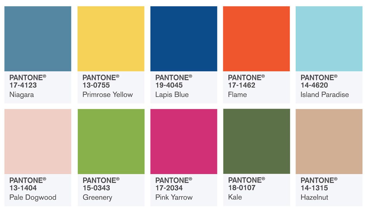
Choose your fashion colors with confidence!
Spring is nigh! Along with it comes the wonderful bright palette of spring and summer colors. Time to freshen up your wardrobe and buy new clothes in the latest designs and new trending colors. But how can you be sure which of those trending colors look best on you? Before you start shopping for new clothes, it’s key to know which colors complement your unique skin tone.
Knowing the basics of the 4 season color theory is a great start to update your look and style to the new spring and summer trends 2017. If you don’t know your season yet, go to my 4 season color analysis page and conduct your own color analysis. If you need help finding your season, consider buying my personal color advice. It is a small price to pay for looking stunning every day.
Once you know your season, you can creatively incorporate the new trending colors in your wardrobe. I made it easy for you! Take a look at the list below and you will find all the colors that are chosen by Pantone as the new trending colors for spring 2017. Since not every color flatters everyone’s skin tone, you will find my skin type (= season type) recommendations per color.
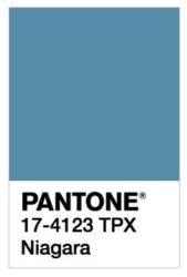 Niagara – grayed blue color: perfect color for all Summer Types (Light / Cool / Soft Summer)
Inspired by the Niagara falls, Pantone introduces this cool, low saturated blue. Blue is a classic color, but by adding grey this Niagara blue has a touch of elegance to it. Casual-chique is a great way to describe outfit combinations in this color.
The best thing about Niagara blue is its similarity with denim blue. Everyone has denim in her/his closet. Find your denim dress, skirt or pants and start enjoying the casual-chic style by combining your denim with charcoal, soft white or medium gray. Denim on denim is also a nice combination.
If you don’t like to use Niagara blue or denim as the main color of your look, use it as an accent color.
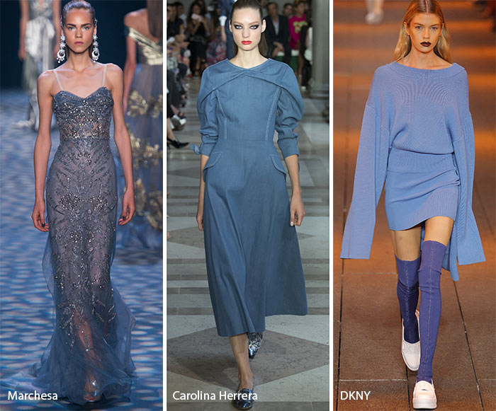
Niagara Blue on the catwalk
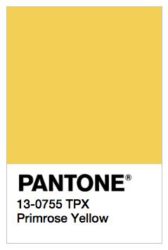 Primrose Yellow – bright yellow color: fun color for all Spring types (Warm / Light / Clear) and for Clear Winter types
A feeling of warmth and passion is what Primrose yellow brings out. It is definitely a bright color that makes you and everyone around you smile.
Many people are intimidated by the idea of bright yellow as a statement color in their outfit since it’s such a bold shade. However, there are plenty of ways to work this color into your outfit in a less daring way. Primrose yellow combined with other warm colors like hazelnut (another color from the Spring 2017 Pantone color palette) would be a successful combination for Spring types.
Pair Primrose yellow with Lapis Blue and the outfit will look perfect on a Clear Winter type since Winter types need high color contrast.
Primrose yellow is also a popular accent color, typically paired with black or dark grey. The dark colors will fade in the background so that Primrose yellow is the highlight of your look. That’s the reason why Primrose yellow would be a great accent color.
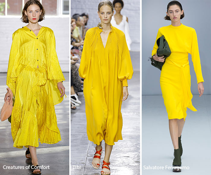
Primrose Yellow on the catwalk
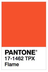 Flame – warm orange red: warm and bright color will complement the skin tone of all Spring types (Warm / Light / Clear) and the Warm Autumn types
The color combination of red and orange makes this hue a true warm, highly saturated color.
Flame demands attention and will stand out in a crowded room. If you are looking for an extroverted outfit that demands to be noticed, add Flame to your wardrobe this spring! Combine this flaming orange with purple (analogous contrast) and you will look perfect for a party or a night on the town whenever you would like to attract attention.
If you like this color but find this color too overwhelming, no worries! Flame is a great accent color. Try dress heels or a handbag in this flaming color and wear it with the darkest color of your personal color palette. This means chocolate brown for Light Spring and Warm Spring, dark brown for Warm Autumn and black or charcoal for Clear Spring.
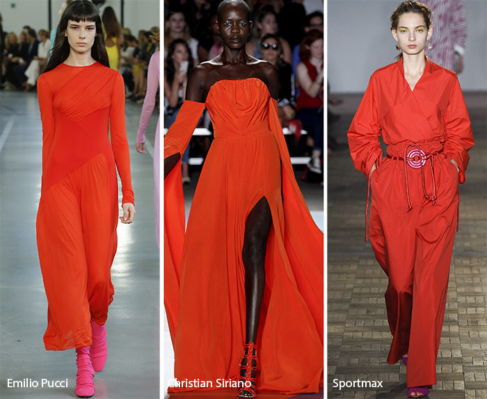
Flame orange red on the catwalk
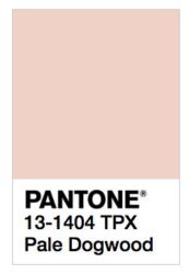 Pale dogwood – soft and light pink: go to neutral color for Summer types (Light / Soft), Light Spring types and Soft Autumn types
Pale dogwood isn’t an overly warm or cool color, it’s more a neutral pink color which makes it easy to combine with either cool or warm colors.
This soft and neutral pink is a tremendous choice for sundresses, blouses and small accessory pieces for your hair and wrists (think bridesmaids dresses). Pair with strappy nude heels to complete the look. Not just women look good in Pale dogwood, this color works well for men as well. If you see a Pale dogwood polo or sweater for him, go for it!
Pale dogwood pairs well with just about anything and everything in your closet. If you prefer a soft and understated ensemble, combine Pale dogwood with other light pinks in suede shoes, sweaters and other richly textured clothes and accessories. This combination will create a sophisticated monochromatic look.
Want to take your monochromatic look to the next level? Combine Pale dogwood with deep pink hues of your personal color palette. You will see that the deep pink will pop against the lightness of the Pale dogwood.
Light / Soft Summer Types: This soft pink can be worn with jeans or Niagara blue, however, it needs to look intentional. A blouse in this soft pink with jeans is not going to cut it. Polish up with accessories.

Pale dogwood on the catwalk
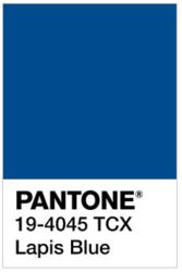 Lapis Blue – intense blue: bright and cool shade conveying inner strength and confidence. Power color for all Winter types (Cool / Clear / Deep)
Lapis blue takes its name from the semi-precious Lapis Lazuli – a bright blue stone that signifies truth and enlightenment.
This highly saturated color has a younger and more vivid feel to it than other deep blues. Lapis blue is a good option for the basic elements of your wardrobe, for your outerwear and don’t forget accessories in this strong and bright color.
This intense blue shade has the advantage that it can be combined with many colors: black, white, emerald green, primrose yellow and other shades of blue. As a winter type, you are the queen of contrast, so bring it on!
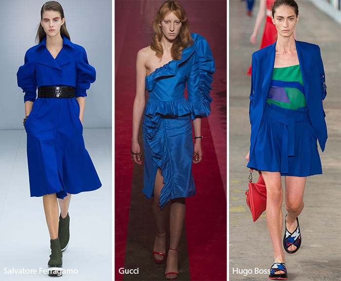
Lapis Blue on the catwalk
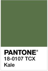 Kale – abundant and rich natural green: kale expresses natural beauty, this warm gray-green should be in every Autumn type’s (Warm / Deep / Soft) closet
At first glance, kale appears to be a drab grey-green but that is a mistake! Kale has to be explored to be appreciated. It is a natural green hue with tangy yellow undertones. This hue is very versatile and can be used in outfits for many different occasions.
This abundant and rich natural green shade is certainly suitable for hiking and military-styled clothing. That doesn’t mean that it can only be used in a casual style. For noble and sophisticated office attire, combine kale with dark brown, ivory or hazelnut.
Warm Autumns who prefer higher color contrast can opt to combine kale with more vibrant colors like orange or flame.
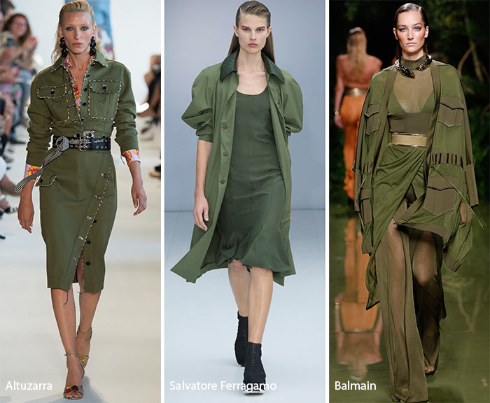
Kale on the catwalk
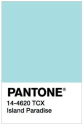 Island Paradise – light and cool blue-green: this energizing aqua is a great choice for all Summer types (Light / Cool / Soft), Light Spring types and Cool Winter types
Island Paradise is a cool blue-green shade which symbolizes tropical settings and promotes pleasant thoughts.
This light blue color looks beautiful in vacation garments, light coats, cashmere sweaters and cardigans. If you like the new Pantone spring 2017 color Pale dogwood and it flatters your skin tone, it would be a lovely combination with this light blue shade.
If you are looking for jewel tones or accessories to accentuate your Island paradise outfit, try silver, aquamarine, lighter shades of leather and rose gold.
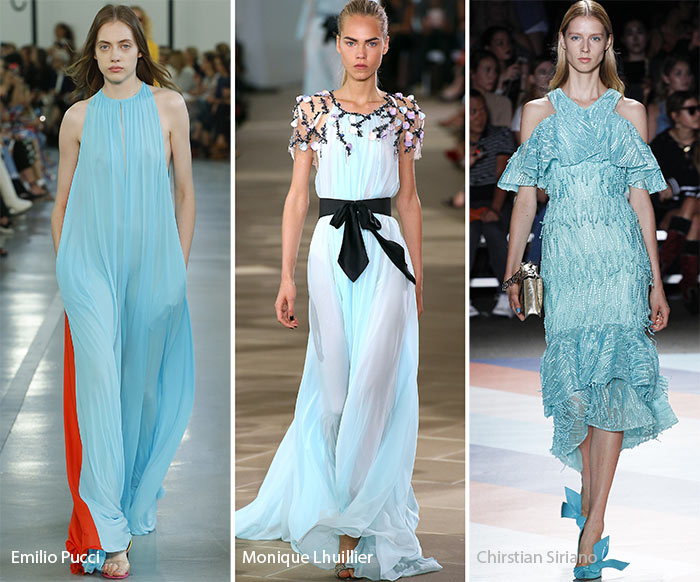
Island Paradise on the catwalk
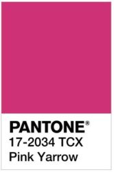 Pink Yarrow – vivid and bold: this lively pink is a captivating and stimulating color, a perfect match for Winter types (Cool / Clear / Deep) who like to be seen
This bold berry hue Pink yarrow is like hot pink edging on purple which makes it a cool color.
Many color combinations are possible with this versatile color.
For a vibrant and bold look, combine Pink yarrow with lapis blue, grey, black, turquoise, emerald green or simply white. Remember, high color contrast looks great on Winter types!
Want to go for an over-the-top feminine vibe? Create an analogous effect by adding rich blue-reds or more pinks.
Accessorize by offsetting the brightness of Pink yarrow with clean, cool silver.
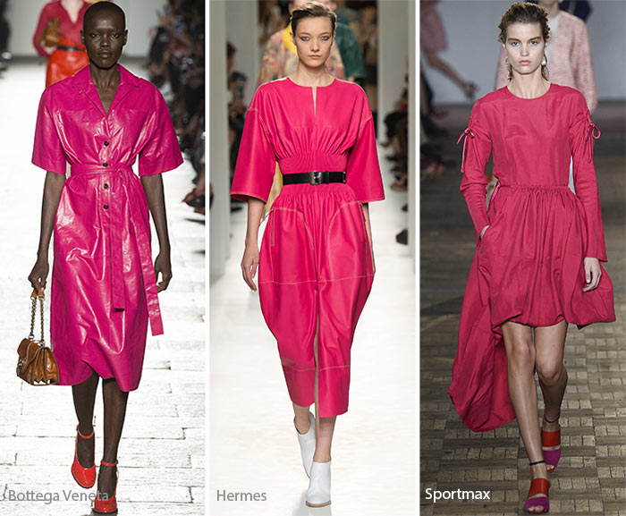
Yarrow Pink on the catwalk
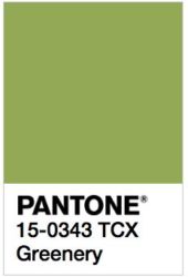
Greenery – fresh and zesty green: this colors reminds us of the first days of spring when new leaves start sprouting. No surprise that this is the perfect color for Spring types (Light / Clear / Warm)
This is Pantone’s color of the year! Greenery is a combination of tulip leaf green with a dash of warm yellow.
Greenery is not limited by age or gender. So guys, please try this color in your new outfit.
How can you wear it? Many color combinations are possible! Pair greenery with soft white, red, orange, yellow or warm blue (blue with some red or yellow added).
Want a vivid and stunning look? Black and greenery makes a great combo. Light and Warm Spring types try medium warm grey instead of black.
If you like to catch up with the spring 2017 trends but you’re not fascinated with this hue, use greenery as an accent color. A greenery handbag or greenery high heels will pop as accent color. You can even try green nail polish.
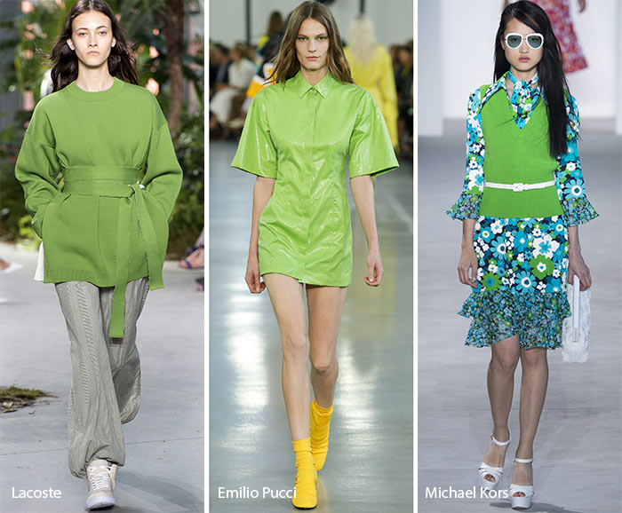
Greenery on the catwalk
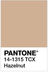 Hazelnut – light, creamy brown: last but not least, this light earthy color is the go-to neutral color for all Autumn types (Warm / Deep / Soft)
This creamy light brown called Hazelnut has a natural feel to it and it adds a warm glow if worn close to your face.
There are many ways you can work this hue into your wardrobe. Since Hazelnut is a muted (=grey is added) color, it pairs well with other muted colors like: ivory, camel or kale.
Another good contrast color choice is flame. Flame-Hazelnut is a beautiful color combination for Warm Autumn types.
If you prefer Hazelnut as an accent color, try a Hazelnut leather backpack or a handbag to finish your look.
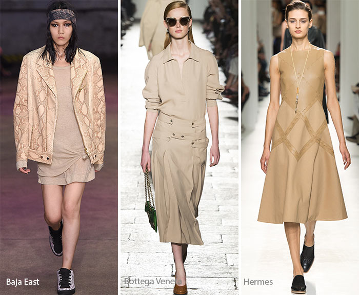
Hazelnut on the catwalk
These are ten beautiful colors we will see tons of this spring and summer. Incorporate your favorite hues in your wardrobe and start looking fabulous! Not sure which colors bring out your best features, I am here to help. Get professional color advice and start wearing your fashion colors with confidence!
In the next 4 blog posts I will be sharing with you how these colors will look on you. I will categorize the trending colors by season type and I will start with the Summer Types. Subscribe to my blog and you will automatically get an email to inform you about my new blog post.
Photo courtesy of Pantone & Vogue